How to Use Color Grading In Premiere Pro
Master the art of color grading in Adobe Premiere Pro with this guide. Learn essential techniques to set the mood, adjust hues, and create professional-quality videos effortlessly.
Table of contents
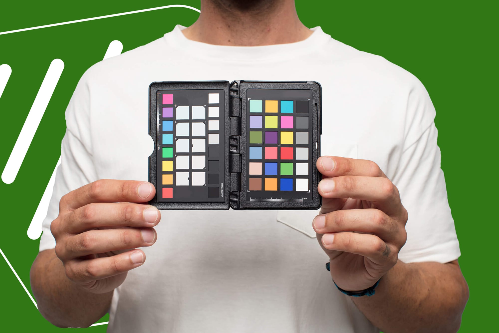
No matter what kind of video project you're working on, whether a cinematic short film, a vlog-style YouTube video, or a marketing promo for some corporate brand, color grading is a huge part of the video editing process.
Beyond helping us get the colors right in situations where natural lighting is impossible, color grading allows us to set our video's mood, style, and emotion however we'd like.
Back in the day, before we had tools like color grading, video creators had a whole different set of challenges to deal with. We'd be stuck wrestling with things like lighting that didn't quite hit the mark, imperfect film stock, or strange color temperatures that had to be fixed before the edit even started.
Today, color grading is practically a must-have skill. Most modern cameras shoot in RAW or LOG formats, which give you a ton of flexibility to tweak colors in post-production. However, if you don't know how to color grade, your footage will look flat, washed out, or dull.
In this guide, we'll cover the basics of color grading and show you how to get started in Adobe Premiere.
Download the perfect soundtrack for your videos with ProTunes One
Sign up to access high-quality music for your projects.
Sign Up NowWhat is Color Grading?
As I noted before, color grading is a skill every video creator should have in their toolkit. At its core, it's the process of adjusting the colors in footage to make everything look cohesive and, most importantly, ensure the mood matches the story you're telling.
In terms of the basics, there are three key components:
- Hue: This is the color itself, such as red, blue, or green. Adjusting hue means shifting the overall color tone of your image. Want a scene that feels warmer? You'll add a bit more orange and yellow to your hue settings.
- Saturation: Saturation is the intensity of those colors. You can add more saturation if you want colors to look bold and punchy. On the other hand, if you want that washed-out, vintage look, you can dial it back and watch the colors start to fade, creating a softer feel.
- Brightness: This one is as straightforward as it sounds. It controls how light or dark the image is. Finding the right brightness can ensure your shots aren't so dark that you lose details in the shadows or too bright that you risk that harsh, washed-out look.
Once you get comfortable with these three, you can take your acronym knowledge a step further with RGB. RGB is the primary light color for Red, Green, and Blue. With these three colors, you can create pretty much any color under the sun, making it a powerful tool for stylizing your videos. These go in line with "hue."
You can dial in specific moods by adjusting the balance of red, green, and blue in your shots. Want a cooler, moody scene? Add a little more blue. Going for a natural, vibrant look? Balance your reds and greens carefully for natural skin tones.
Check out our blog on Color Grading vs. Color Correction.
Color Grading in Premiere Pro
Plenty of tools exist for color grading, including DaVinci Resolve, Final Cut Pro, and After Effects. All of these video software options have their strengths. But for me, Premiere Pro is where it's at. It's intuitive powerful, and it keeps everything I need in one place, so I'll focus on it in this guide.
Premiere Pro has a dedicated Color workspace designed to make color grading as easy as possible. When you switch to this workspace, Premiere gives you a specialized layout with all the tools you need front and centre, so you don't have to jump around the interface.
At the heart of this setup is the Lumetri Color panel, which comes packed with all the essential controls for color grading, including sliders for basic corrections and color wheels for creative looks.
With that in mind, let's look at how to color grade in Premiere Pro.
1. Set Up Your Workspace
First things first, you want to get your workspace ready to go.
Switch over to the Color workspace in Premiere by selecting "Color" from the workspace bar at the top. This will reorganize your screen, bringing the Lumetri Color panel, Effects Controls, and scopes right into view.
2. Use Basic Correction
From here, we can tackle the basics. Head over to the "Basic Correction" tab in the Lumetri Color panel. You can adjust exposure, contrast, highlights, shadows, and more here. Start with simple tweaks:
- Adjust the white balance using the Temperature and Tint sliders.
- Use the Exposure slider to brighten or darken the whole image.
- Balance out highlights and shadows to reveal details without making anything look overexposed or too flat.
Don't worry too much about getting a finalized product here. You just want to get your footage looking clean and balanced.
3. Get Creative with In-depth Tools
Now, let's get a little wild with some creative controls. Switch to the "Creative" tab in Lumetri Color. Here, you'll find pre-set Looks, which are essentially filters that you can use to give your footage a style boost. You can also play around with:
- Faded Film: Adds a vintage vibe.
- Sharpen: Enhances edges for a crisper look.
- Vibrance and Saturation: Boosts your colors without overdoing skin tones.
Don't be afraid to experiment here!
4. Apply Color Curves
You can jump into the Curves section when you're ready to fine-tune things a bit more.
If you've never used color curves before, they can seem intimidating. However, they're actually pretty straightforward. The RGB curve lets you adjust brightness and contrast across different parts of your image. You can drag points on the curve to change the shadows, mid-tones, and highlights separately.
You can also play with Hue vs. Hue, Hue vs. Sat, and Hue vs. Luma curves, which allow you to:
- Change specific colors without affecting others (for example, you can turn a blue sky teal without messing with the rest of the shot).
- Boost saturation in certain hues.
- Adjust brightness levels of particular colors and not others.
5. Color Match
Lastly, if you're working with multiple clips from different cameras or lighting setups, you'll want to use the Color Match feature to match the color tones across all your clips so everything feels consistent.
Select the clip you want to match to, then click "Comparison View" to see it side-by-side with your current clip. Once your reference is set, hit "Apply Match" and let Premiere work its magic. You can always fine-tune after it applies the match, but this feature saves much time getting everything in the same color range.
Using LUTs in Premiere
LUTs (or Look-Up Tables) are basically shortcuts for color grading. They're like pre-made filters that instantly change the color and tone of your footage, making it look more cinematic or giving it a specific style with just a few clicks.
If you're new to color grading or just want to speed things up, LUTs are a great tool to have in your arsenal.
Applying a LUT maps out the colors in your footage, adjusting them based on pre-set values.
There are two main types of LUTs:
- Technical LUTs: These are your workhorse LUTs. Their job is to convert your footage from one color space to another, like from LOG to Rec.709. They help get your footage to look "normal" before you start adding any creative color grading.
- Creative LUTs: These are the fun ones. With creative LUTs, you can add specific looks or styles to your footage, such as a teal-and-orange blockbuster look or a vintage sepia tone.
One word of caution, though: it's easy to go LUT-crazy, especially with trendy LUTs. However, just because you can add a super-stylized LUT to every clip doesn't mean you should. Overusing them can make your footage look overdone or even mess up skin tones if you're not careful.
Here's a quick guide on how to apply a LUT in Premiere:
Step-By-Step Guide for LUTS
- In the Lumetri Color panel, go to the Basic Correction or Creative section (depending on if you're using a technical or creative LUT).
- Find the Input LUT dropdown in Basic Correction or Look dropdown in Creative, then click Browse to select your LUT file.
- Apply it, and voilà, instant color change! You can also adjust the intensity to your liking.
Color Grading Skin Tones
One of the most important parts of color grading is getting skin tones to look natural.
Nothing pulls a viewer out of a video faster than skin tones that look too orange, too green, or just plain unnatural. Plus, skin tones are often the anchor for color grading, as they help everything else fall into place visually.
Start with the Right White Balance and Exposure
Before looking at specific color adjustments, ensure your white balance and exposure are on point. Improper white balance can throw off skin tones, making them look either too cool (blueish) or too warm (orangey).
Exposure is just as important. If your footage is too dark or blown out, it'll be harder to adjust skin tones accurately later on.
Adjust Tint and Fine-Tune White Balance
Sometimes, even after setting the main white balance, skin tones need a bit of extra tweaking. This is where the Tint control can be helpful.
Adjust the tint slightly to the green or magenta side to bring skin tones closer to that natural, true-to-life look.
Maintain Consistency Across All Footage
If you're working with multiple clips, especially from different cameras or lighting setups, it's easy for skin tones to look inconsistent. One clip might have a slightly warm tint, while another leans cooler.
You can use the Color Match feature or compare clips side-by-side to make sure skin tones stay consistent from one scene to the next.
Pay Attention to HSL (Hue, Saturation, Luminance)
To really nail your skin tones, the HSL sliders in the Lumetri Color panel are your best friend. By adjusting Hue (the actual color), Saturation (intensity), and Luminance (brightness) for specific colors, you can control how skin tones appear without affecting other parts of the image.
Avoid Over-Saturation
While adding saturation for a vibrant look is tempting, too much can make skin tones look fake or exaggerated. Use the Saturation slider with a light touch, and rely more on HSL adjustments to fine-tune. Think natural, not neon.
Finally, I highly recommend testing your footage on multiple screens. Skin tones can look very different on a laptop or a phone screen than on a high-end monitor, and you catch inconsistencies by checking on as many as possible.
Final Thoughts
Color grading requires a little bit of technical know-how and a touch of creative intuition.
When used properly, it can bring your vision to life, giving your video that final touch of polish to help convey the desired emotion. Of course, like any skill, it takes practice, a good eye, and a willingness to experiment. But once you've got the hang of it, you'll be amazed at how much impact the right color grade can have on your final product.
Looking to take your project even further?
Sound is just as critical to great video as color, and finding the right music can make all the difference. Check out ProTunes One, where you'll find a massive library of background tracks designed to give your content the extra edge it needs.
With a powerful AI-driven search tool, you can pinpoint the perfect match in seconds, and all tracks come royalty-free, so you're free to publish anywhere without hassle.
Get started today and give your project the soundtrack it deserves!

